

Today, most people browse the internet on their smartphones. Whether they’re searching for a service, comparing products, or contacting a business, the journey often begins on a mobile device. That’s why businesses can no longer treat mobile as an afterthought.
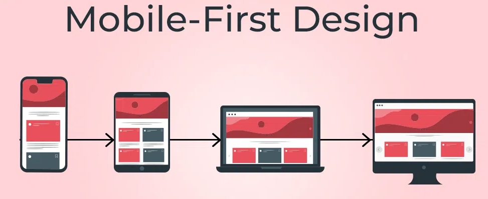
Mobile-first design is a modern web design approach that prioritises the mobile experience from the very beginning. Instead of designing for desktop first and then trying to make everything fit on a smaller screen, designers build the mobile version first before expanding it for tablets and desktops.
The result is a website that is easier to use, faster to navigate, and better suited to how people browse the web today.
What Is Mobile-First Design?
Mobile-first design means creating a website with smartphone users in mind before considering larger screens.
This approach focuses on the essentials. Every section, button, image, and piece of content is carefully planned to ensure it works well on a smaller display. Once the mobile experience is complete, additional features and layouts can be added for larger devices without compromising usability.
Rather than removing elements from a desktop website, mobile-first design starts with simplicity and builds up where appropriate.
Why Mobile-First Matters
User behaviour has changed significantly over the past decade. People expect websites to load quickly, display correctly, and be easy to navigate on any device.
If visitors have to zoom in, struggle to tap buttons, or wait for pages to load, they’re more likely to leave and visit a competitor instead.
A mobile-first website helps businesses:
- Create a better first impression
- Improve user engagement
- Reduce bounce rates
- Increase enquiries and conversions
- Reach customers wherever they are
Since mobile is often the first point of contact, delivering a smooth experience can have a direct impact on business growth.
Better Experience for Every Visitor
A good mobile-first website isn’t simply a smaller version of the desktop site. It is designed around how people naturally use their phones.
This includes:
- Easy-to-read text without zooming
- Simple navigation menus
- Buttons that are easy to tap
- Well-spaced content
- Fast-loading pages
- Clear calls to action
When visitors can quickly find what they’re looking for, they’re more likely to stay on your website and take the next step.
Mobile-First Supports SEO
Search engines place a strong emphasis on mobile usability. Since most users now search on mobile devices, websites that perform well on smaller screens are better positioned to compete in search results.
While SEO depends on many factors, mobile-friendly design contributes to:
- Faster loading speeds
- Improved user experience
- Lower bounce rates
- Better accessibility
- Stronger search visibility
A website that performs well on mobile benefits both users and search engines.
Faster Websites Perform Better
Mobile-first design encourages developers to focus on efficiency from the beginning.
By prioritising essential content and reducing unnecessary elements, websites often become lighter and faster to load.
Performance improvements may include:
- Optimised images
- Clean, efficient code
- Reduced page size
- Faster server response
- Streamlined layouts
A faster website not only improves the user experience but also increases the likelihood that visitors will stay and explore.
Mobile-First Doesn’t Mean Mobile Only
One common misconception is that mobile-first design ignores desktop users. In reality, it does the opposite.
The mobile experience forms the foundation, while larger screens take advantage of the extra space with enhanced layouts, larger visuals, and additional content where appropriate.
This approach creates consistency across all devices, ensuring users enjoy the same quality experience whether they’re using a smartphone, tablet, laptop, or desktop computer.
Signs Your Website Needs a Mobile-First RedesignIf your website was built several years ago, it may no longer meet modern user expectations.
Some common warning signs include:
- Text is difficult to read on mobile devices
- Navigation feels confusing on smaller screens
- Buttons are too small to tap comfortably
- Pages load slowly on mobile networks
- Images don’t resize properly
- Visitors leave your website quickly
Addressing these issues can significantly improve both usability and overall website performance.
Mobile-First Is Simply Good Website Design
A great website should work wherever your customers are. Whether they’re browsing on a phone during their commute or researching your services on a desktop at work, the experience should feel equally smooth and intuitive.
That’s why mobile-first design has become the foundation of modern web development. By focusing on the mobile experience from the start, businesses create websites that are faster, easier to use, and better equipped to meet today’s customer expectations.
